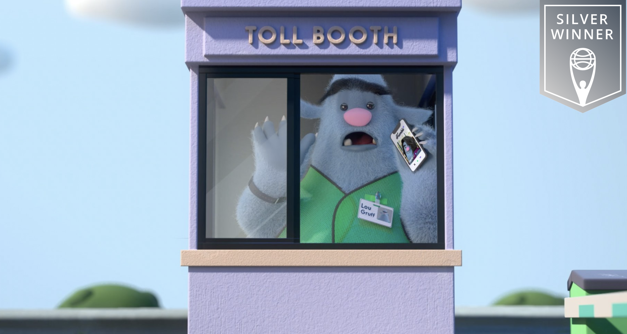
Nobody is happy going through tolls. They take forever. You fumble with your cash or credit card. It just makes you grumpy. Dare we say it can turn you into a bit of a troll. We wanted to show the physical embodiment of that feeling. Enter Lou, the toll troll that shows firsthand how frustrating tolls can be.
We launched a paid social campaign to bring awareness to the hassles of using tolls without GoToll. Lou helped make that vision a reality by connecting with our audience emotionally, resulting in increased installs.
Who could ever be grumpy about that? Then you top it off with a Clio… Nope, not grumpy at all.
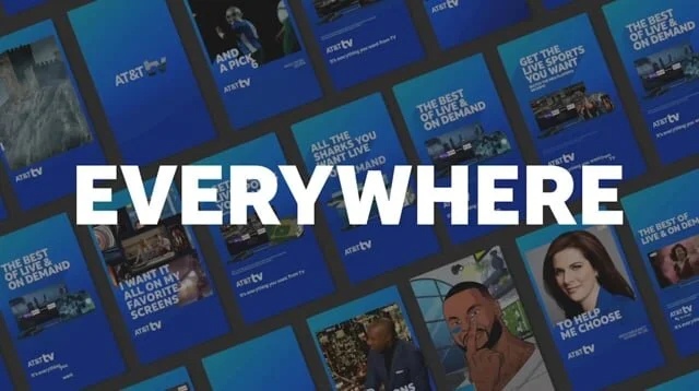
Just ok is not ok — AT&T’s brand platform revolves around the notion that if you’re not with America’s Best Network, you’re just getting ok service.
My contributions to this brand include digital work that adapts the core platform idea into concepts that thrive in a sound-off environment. This includes anything from short digital videos to interactive banners to Facebook/Instagram stories and Snapchat lenses/games. The tone of the brand is rooted in humour, which happens to be my favourite tone to write in — yay!
Scroll to the bottom and you’ll find a reel showcasing digital platform work for AT&T TV.
AD: Matt Schwartz
Health-Ade has your gut’s best interests in mind. It’s your snacking sidekick, your plus one at every meal. There cheering you along one delicious bite and sip at a time.
We wanted to bring that experience to life with Health-Ade as your inner voice of YASSSS!!!! – to all the things… The snacky things, the refreshing things, the real fruit flavoured things, and the effervescent bubbly things that make us feel good from the inside out.
So grab a bottle or can or both and…
THRILL YOUR GUT!
Every year, PC introduces their new summer Must Try product lineup. This year, they wanted to do so in a fun, shareable way that really puts the must in Must Try.
Using slight of hand tricks we created some fun Instagram videos that are a feast for the eyes.
Remember when pickleball was all the craze? You could hear those pops for miles. And the chatter, the laughter… Pickleball really is a different game. A mix of sport and hold my beer. A calling to rekindle what you once loved from yesteryear. To discover something new and something inside of you, maybe you didn’t think you had. No pressure. This is what makes it good.
This was a project to launch a new business venture from scratch. We were tasked with everything from coming up with the business name, logo, design, language, and overall tone. It’s one of my faves.
Most women have experimented with their hair and have run their strands through some torture tests all for the sake of beauty.
We wanted to inspire women to embrace their hair’s natural beauty, to be proud of the strands they were born with and rock what they got. I helped develop a new edgier tone for the brand, bringing it to life with an online video and revamped content for their social feed.
Read more about it here: OGX Inspires You to #RockWhatYouGot in New Campaign from Juniper Park\TBWA
Credits: Copywriters: Sabrina Christo & Emily Ferraro // Art Directors: Lianna Petridis & Neil Domingues
The Run has been going strong for the last 25+ years, but has seen a steady decline in fundraising in recent years. We needed to remind people that breast cancer hasn’t gone away and those who are going through the journey still need support.
We wanted to give the viewer a glimpse into the world of those who have been touched by this disease. To be moved by their strength and be empowered to make a promise to help change the future of breast cancer.
Read more about it here: CIBC Run for the Cure wants pinky promises
Along with this, we created a symbol that untied all who made their promise to run. Naturally, the pinky was perfect for this, which is why you see it throughout the creative as a way to gain traction for this initiative. As you’ll see below, the response on Run day was great with people proudly showing off their painted pinkies in support. To top it off, we also exceeded the client’s fundraising goal by one million dollars!
Photographer: Nikki Ormerod with Westside Studio
Director: David Masters with Skin and Bones
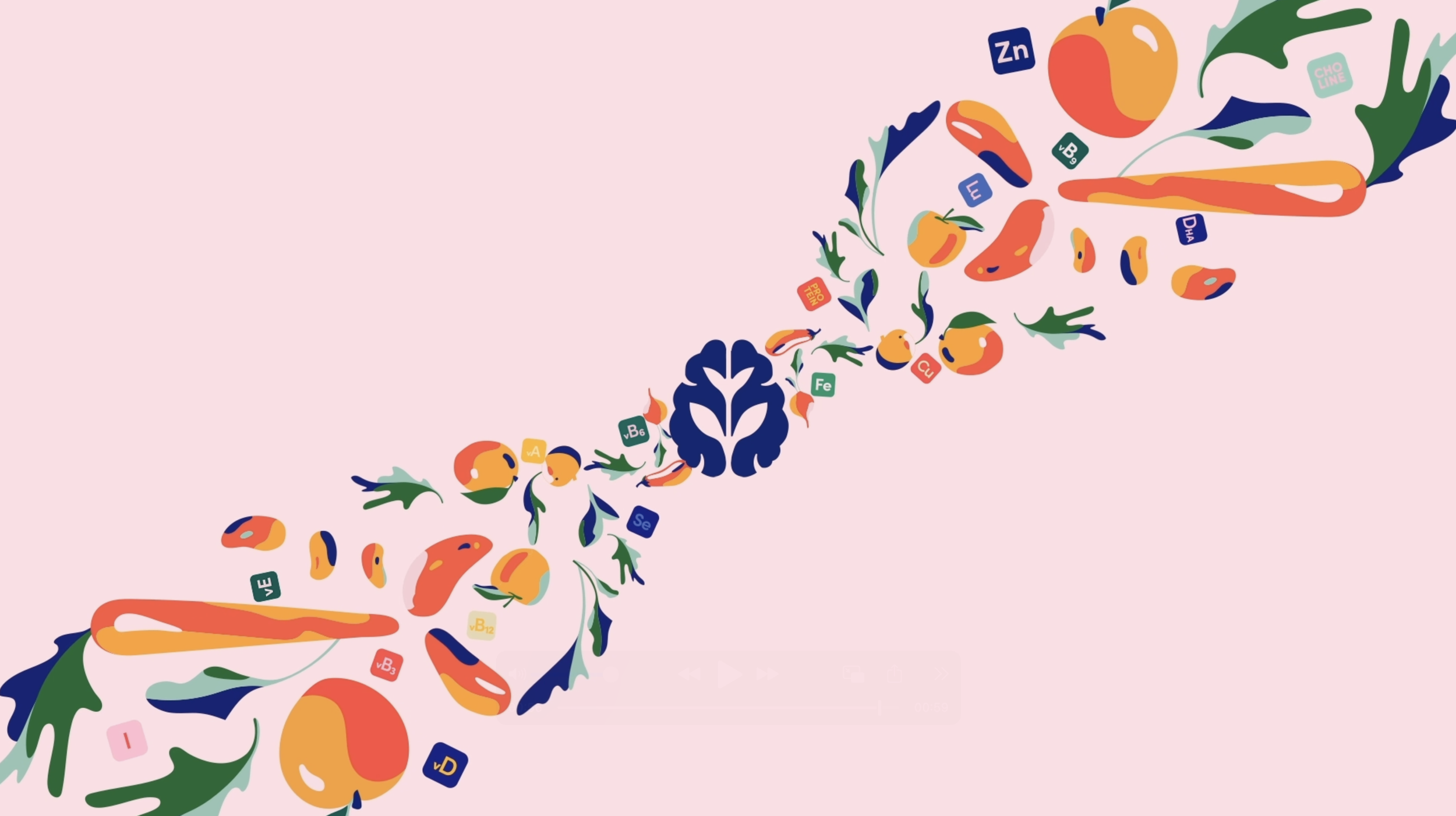
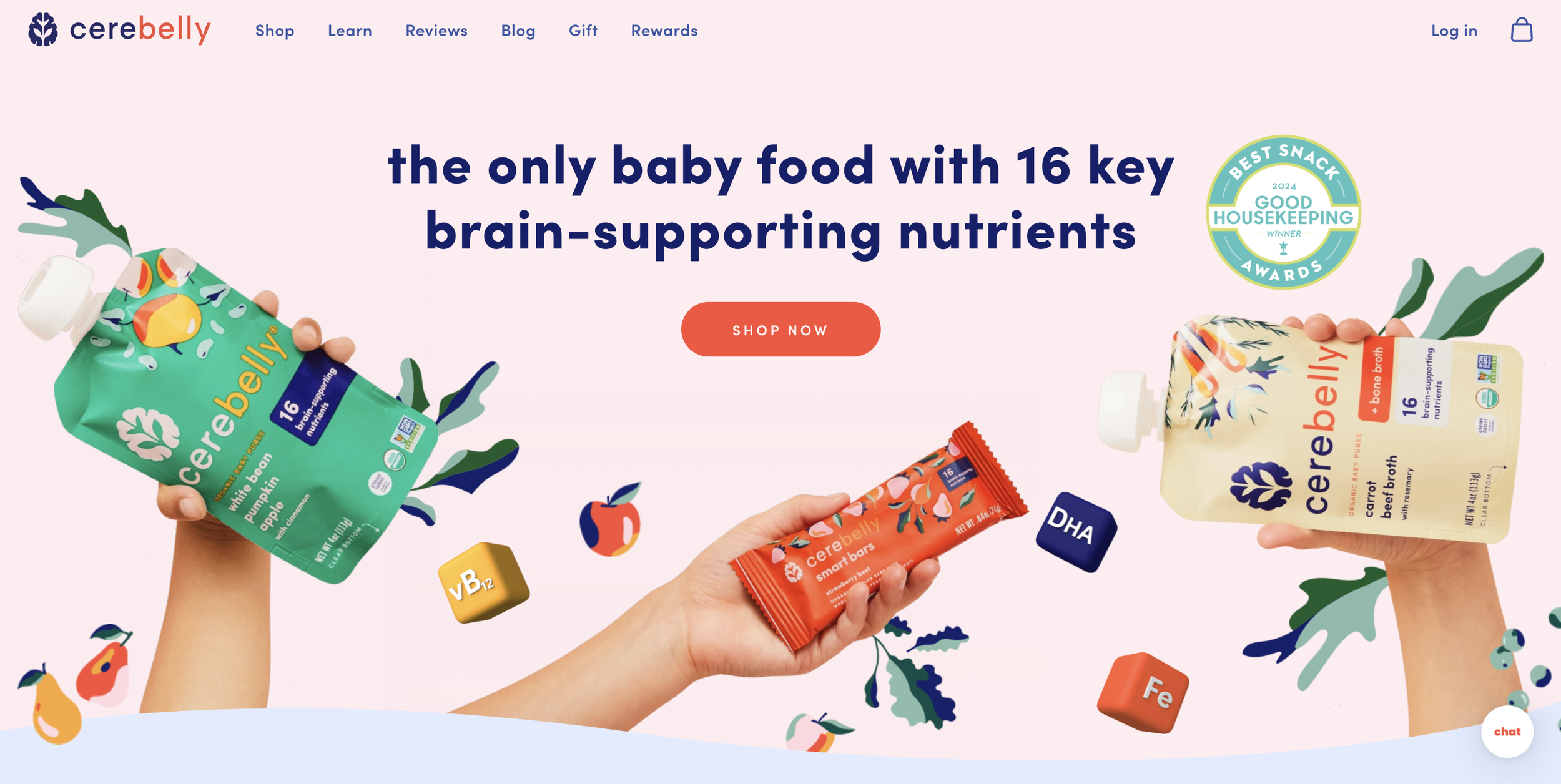
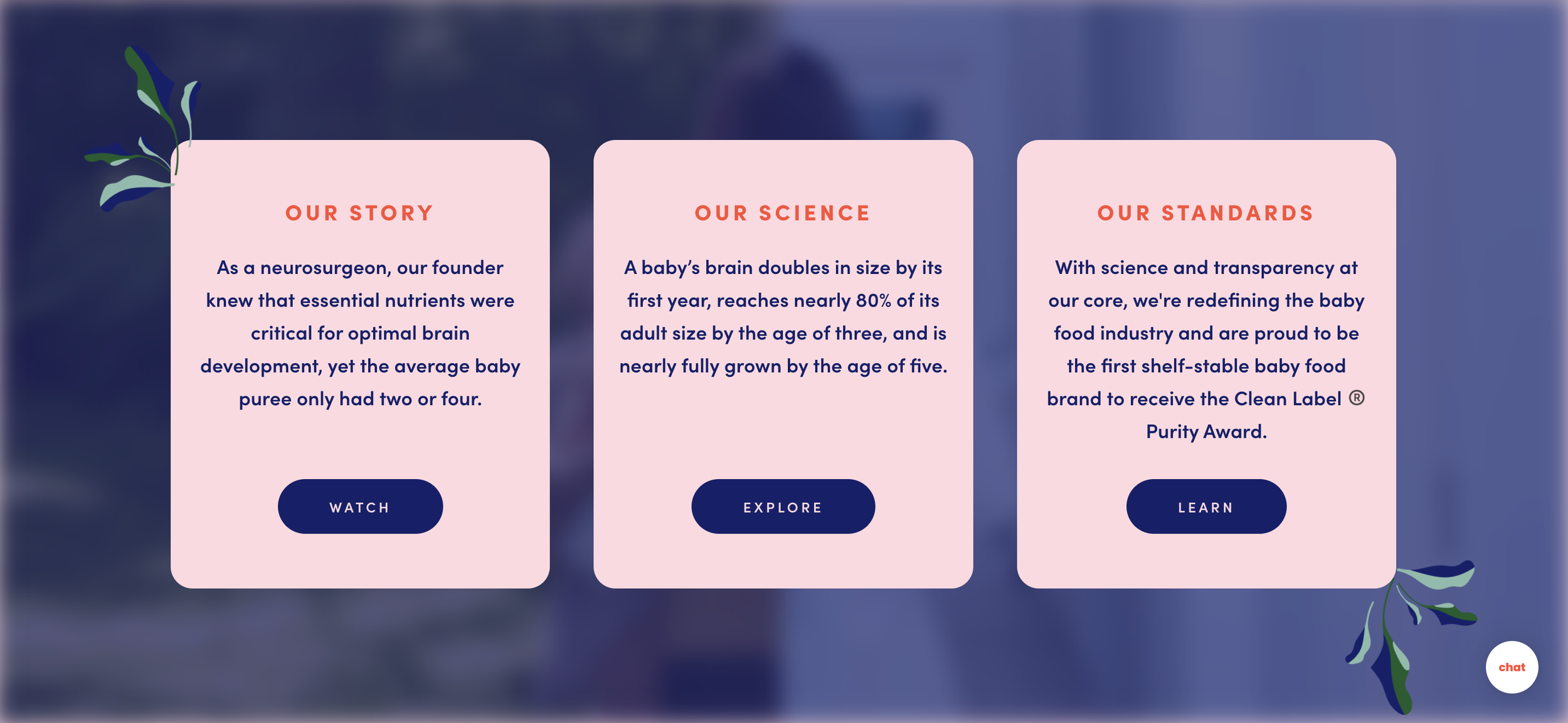
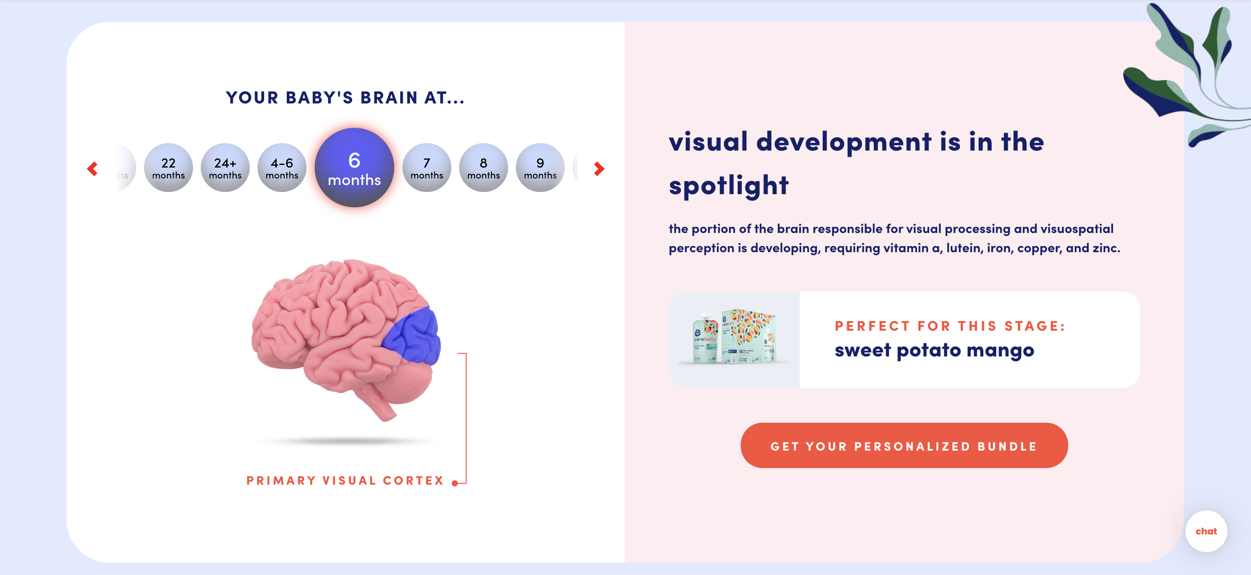
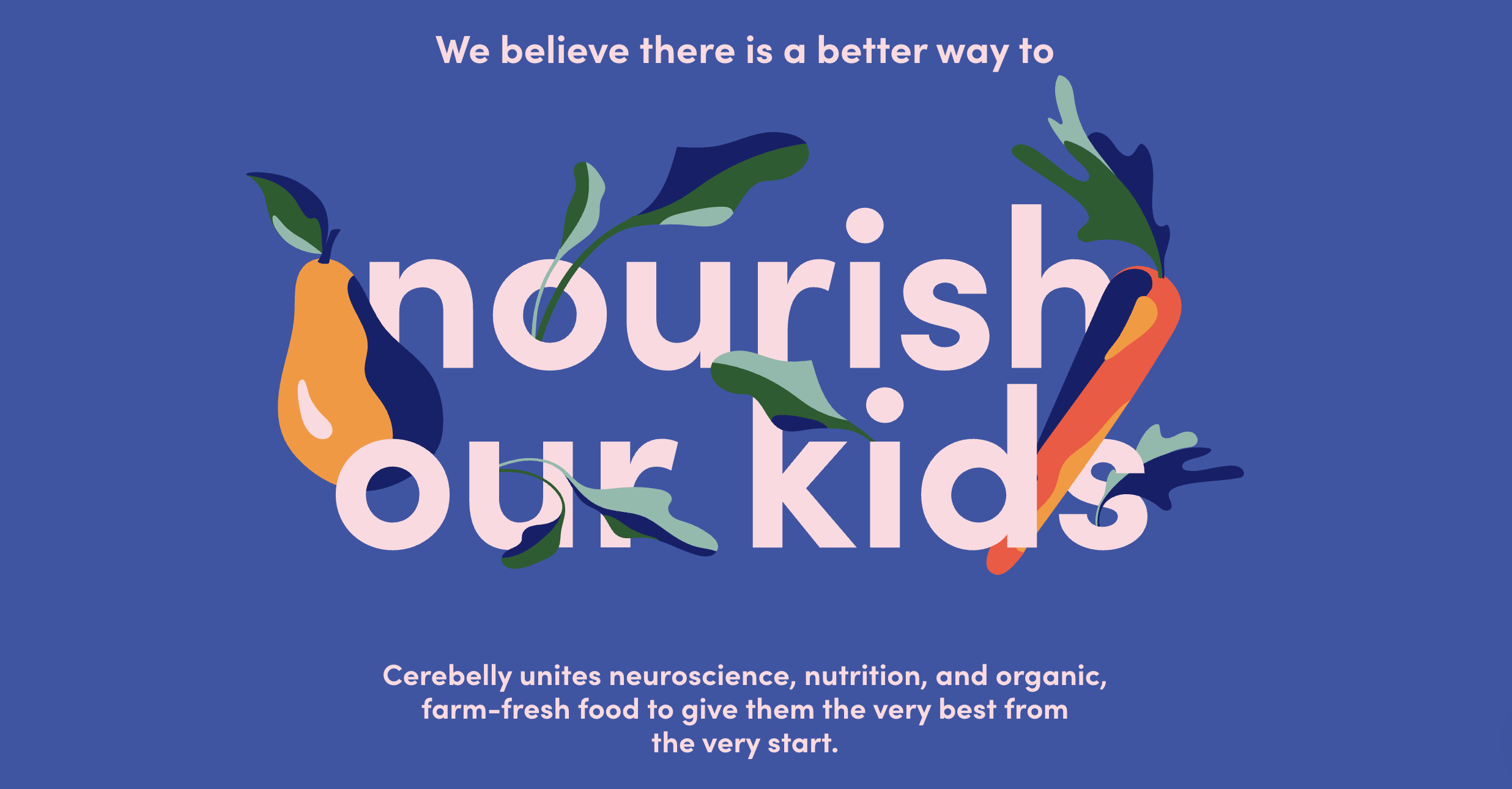
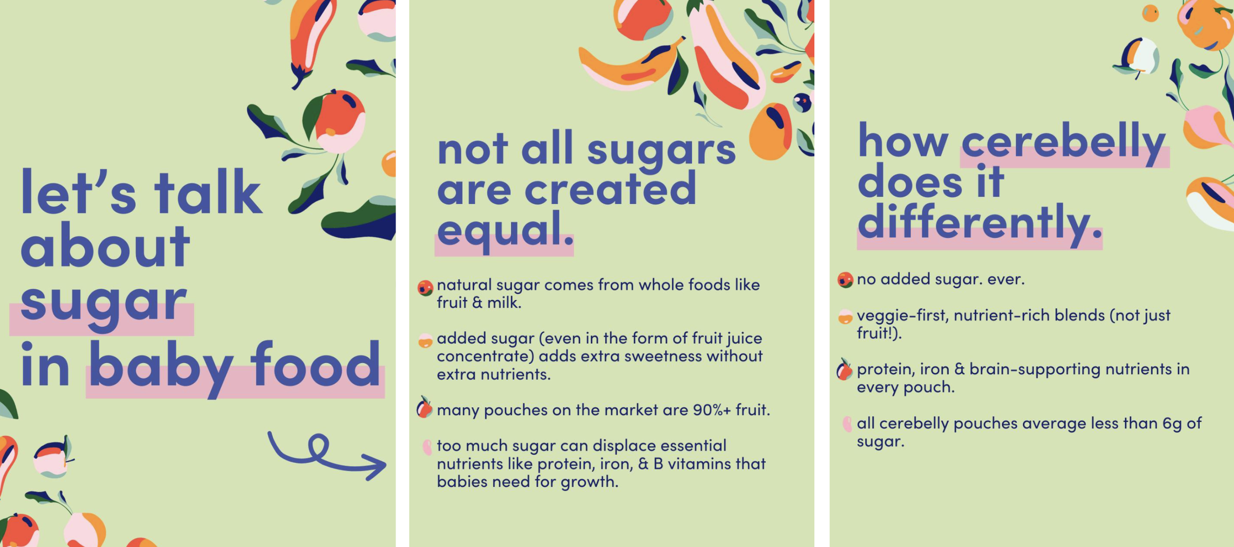
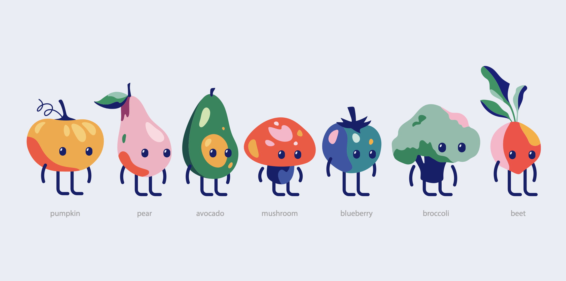
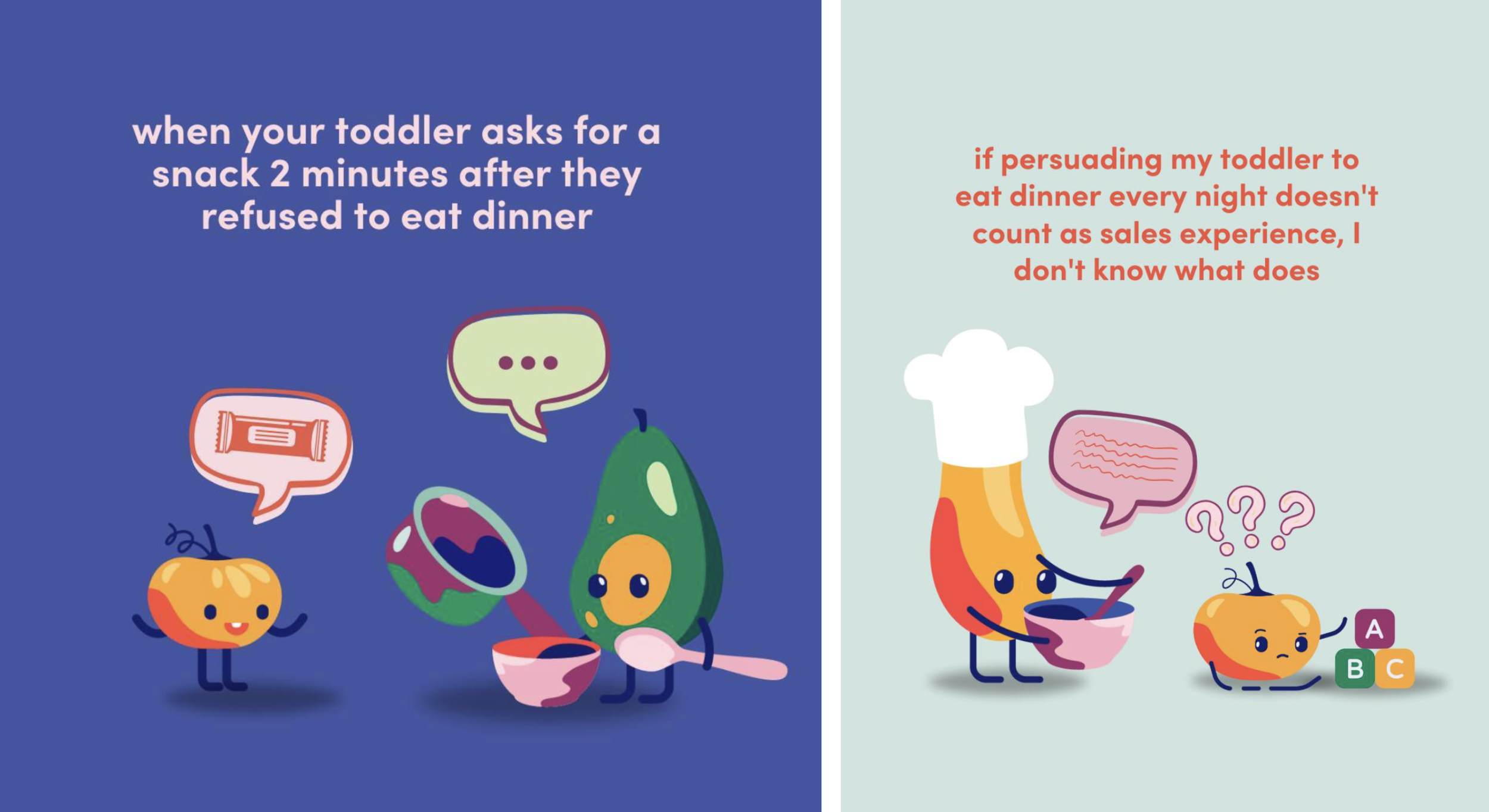
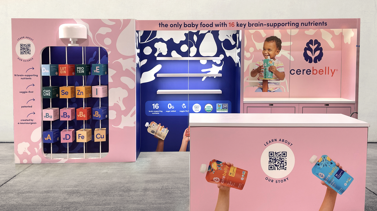
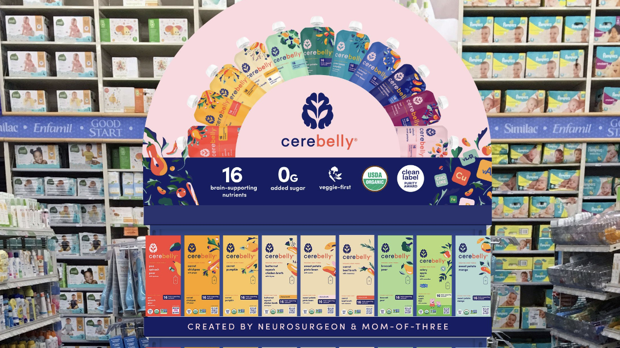
Parenting is hard work, and there is no formula for success - it’s an art. But when it comes to the nutrients kids need during every stage of their development - that’s science.
Cerebelly is founded on studying and creating the perfect blend of foods a brain needs as it grows. Our job was to help them get the word out to as many parents as possible.
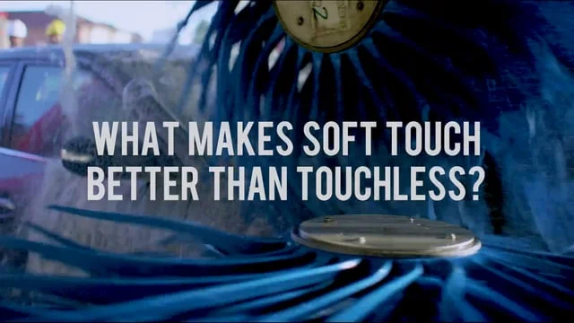
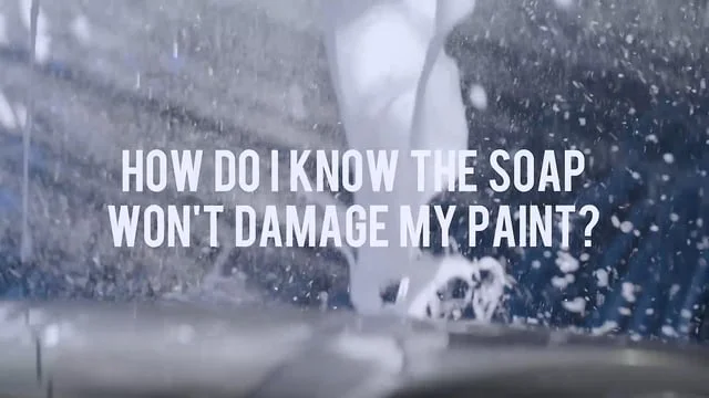
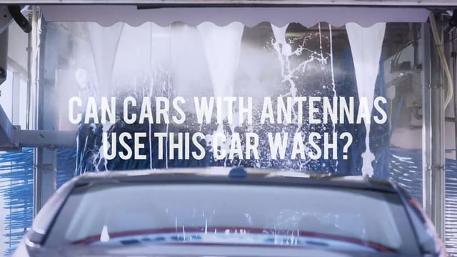
You wouldn’t use a spritz of water to clean mud or dirt off the floor, why would you on your car? Bottom line is, if you don’t scrub it away you don’t get a complete clean. So why pay for almost clean with touchless?
We wanted to show people how touchless just doesn’t work in comparison to Petro-Canada’s friction based Soft Touch car wash, which is gentle on your car while giving it a complete clean.
We also anticipated people may have questions as to what exactly Soft Touch is and what makes it better. So instead of waiting for them to ask us about it, we went ahead and created some Soft Touch Q&As. As you’ll see below, we repurposed our car wash footage from the main spots and got our VO guy to have at it reading our answers.
Director: Brett Blackwell with Nimble
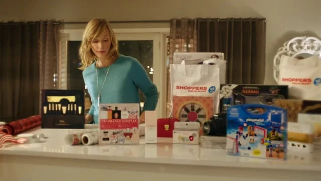
We all know the drill when it comes to Christmas shopping - run around from store to store in a dash to get everything on our lists. What we may not know is Shoppers Drug Mart offers an array of gifts all in one convenient location.
With the help of a little Christmas magic, we brought the 'Jolly' back to the holidays.
Read more about it here: Shoppers Drug Mart’s ‘Jollydays’
Credits: Creative: Sabrina Christo & Neil Domingues // Production: George Lin & Alexandra Manahan
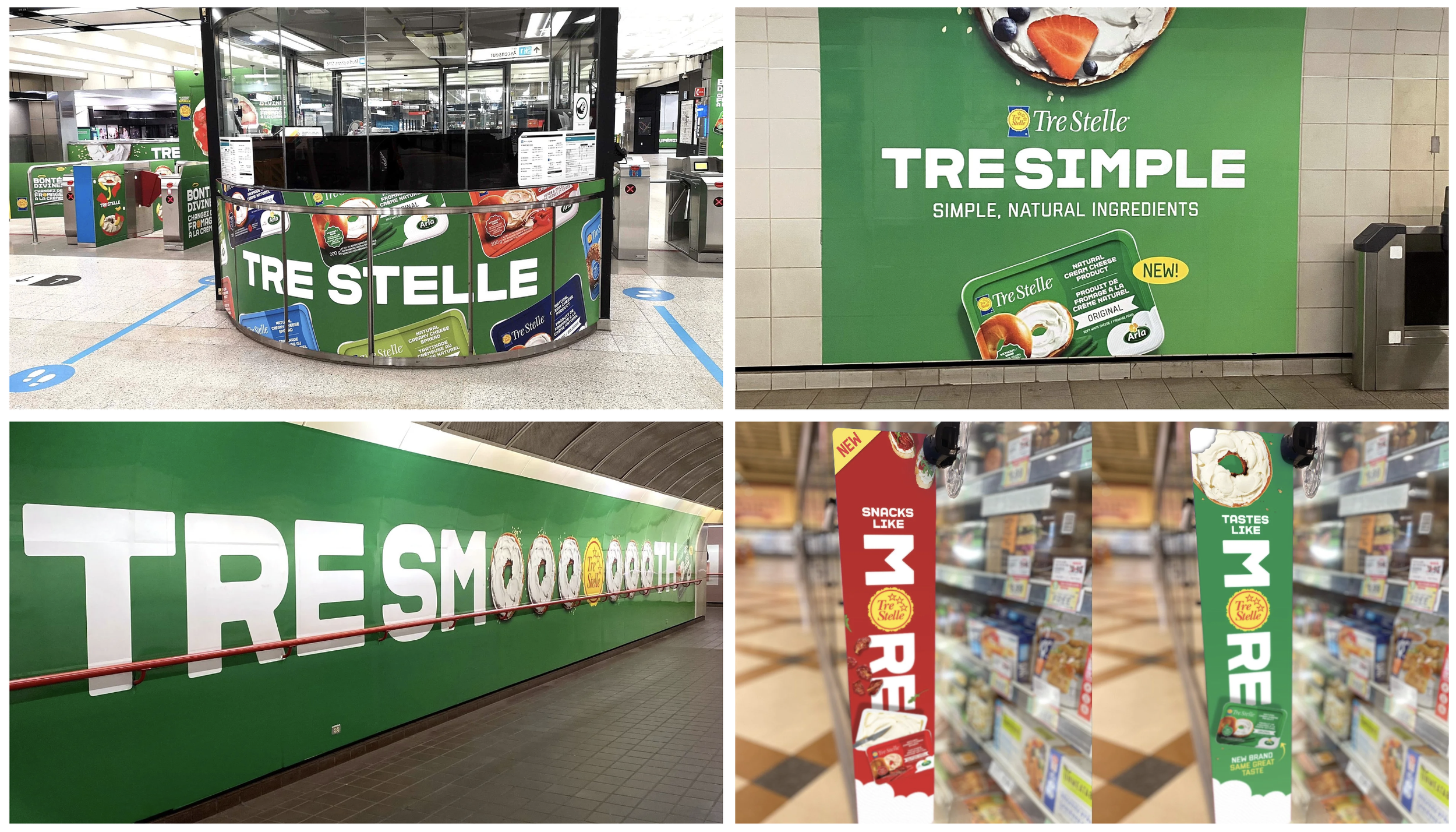
When you’re going up against the number one cream cheese in the market you need to break through.
And when your product is yummier, creamier, spreadier, and made with fewer ingredients than you know who, you’ve earned the bragging rights to say it Tastes Like More.
“Tastes Like More” became our platform. It ran across social, TV and OOH. It showed Canadians they have choice when it comes to cream cheese. To top it off, it captured 4% of market share. Not bad for a little tub.
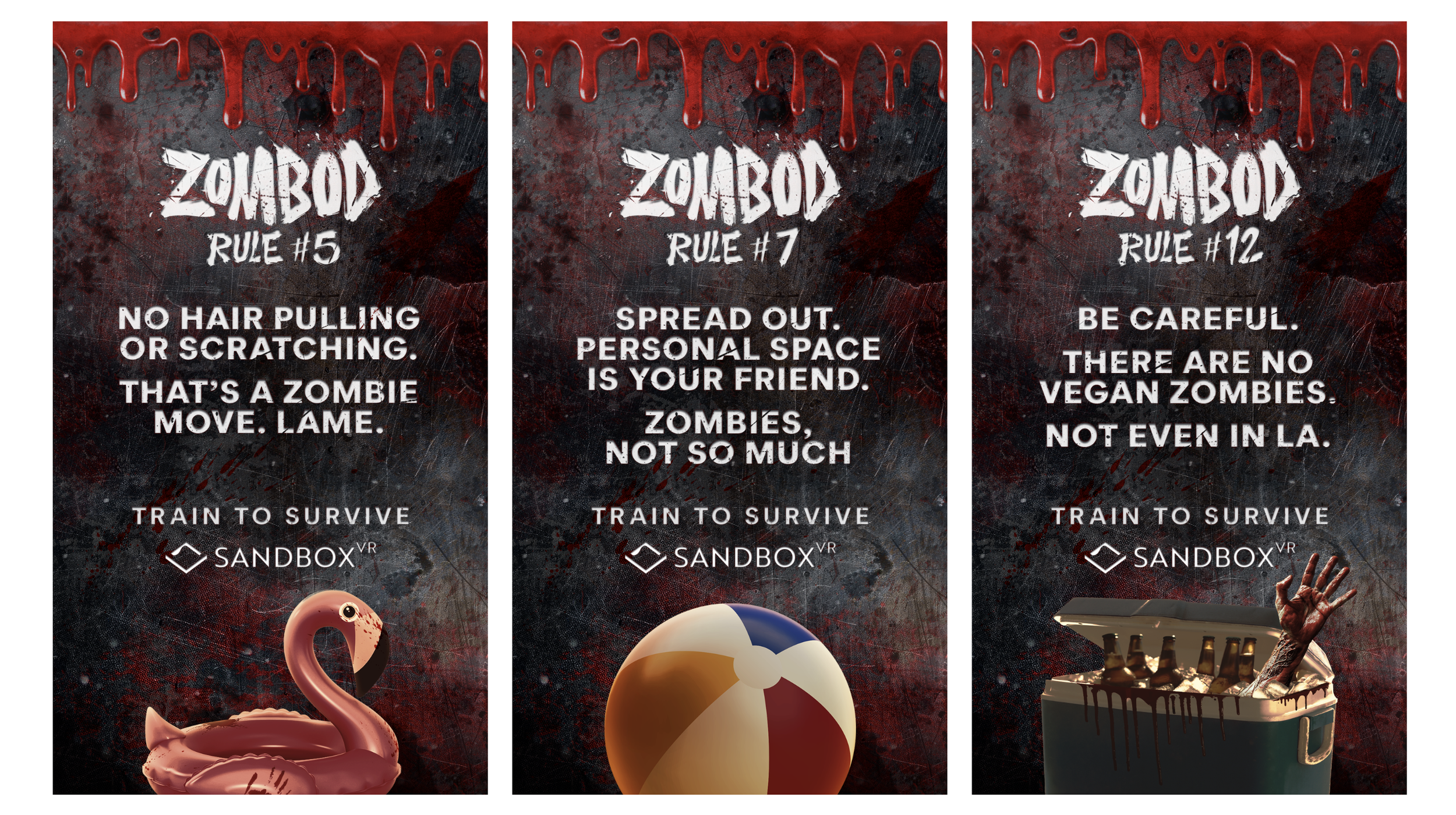
Just when you thought you lived through everything... a summer zombie apocalypse. It never ends.
But there was an even bigger problem. No one was ready for it. I mean look at us - we don’t even double-knot our shoes, so no way we’re ready to take on a zombie apocalypse. But we will be… Oh, you bet we will be.
That’s why we created a fun sense of urgency to really give people a reason to get up. Get offline. Grab their squad. Head over to Sandbox VR and… GET ZOMBOD READY!!!
Even Entertainment Tonight got in on the action.
A lot of times we over analyse, over strategise, and over think, which leads us away from simplicity and how simply wonderful it can be.
This was one of those times. Simple stepped in and did what it did best, lead the way for a concept that elevated an iconic product simply by playing into it’s clout. It is Slurpee, after all. It’s kind of a big deal.
The “ee” language structure influenced an entire design system that was playful, colourful, and stood out in social feeds across Canada, as well as in-store, OOH, and on merch.
And if you’re wondering about the fried chicken in the sizzle reel… It’s not there to subliminally make you hungry and in turn thirsty for a Slurpee. We worked on a mini campaign to promote the launch of their Crispy Classic Chicken, too.
Beam is a payments platform. A bridge between traditional finance and blockchain technology. Did I say bridge? I meant portal. That’s way more fun.
At least we thought so. And I’ll never not shout out and share amazing work, even if never saw the light of day.
We pitched this character and concept to Ansible with the goal of making a financial blockchain product more approachable while standing out in a category that was met with retail uncertainty and skepticism at the time.
Why a beam and space theme?
Because on this platform, money moves at the speed of light. And space is cool.
With their new lineup of teas that come in a unique drawstring bag, Tetley makes it even easier for you squeeze out more of that delicious tea flavour.
We wanted to emphasize this idea of "squeezing out more", so we squeezed out little details from typical tea drinking moments and spun in the playful tea names to create these charming scenarios.
Bringing together the runners, the gamers, the techies, trendies, and tree huggers with a brand relaunch that blends web2 & web3 in the real world.
STEPN is a web3 lifestyle app that rewards movement while encouraging healthy and sustainable change. We worked with STEPN on branding, messaging, campaign, and social to relaunch the brand with our “It’s a movement” rally.
Office spaces should work.
For employees.
For landlords.
For everyone.
Employees spend one-third of their lives working in offices. Let that sink in. That’s one-third of their lives spent with coworkers. One-third of their lives attending those “this could have been an email” meetings. One-third of their lives waiting for a microwave and silently cursing whoever broke the no fish rule.
While clear_space can’t change those realities, they can change offices for the better. We took this spirit to create a brand expression that puts their design work at center stage. Showcasing the reality that work culture can move beyond the standard, when we create spaces made to work.
What happens when you let your mind wander? You start to think things. Random things. Meaning of life things. And whether a better for you soda that actually tastes good can ever exist?
Folks, you’re in luck. This is not a daydream. It’s gut-healthy “Sundeniably” delicious reality in a cool, quenching can of SunSip soda.
The essence of the brand was Cali-beachey-70s-chill. We leaned into it with a social campaign that felt like a snippet from a sitcom out of that era and framed it in a postcard to nod to the brand’s classic flavours and west coast vibe.